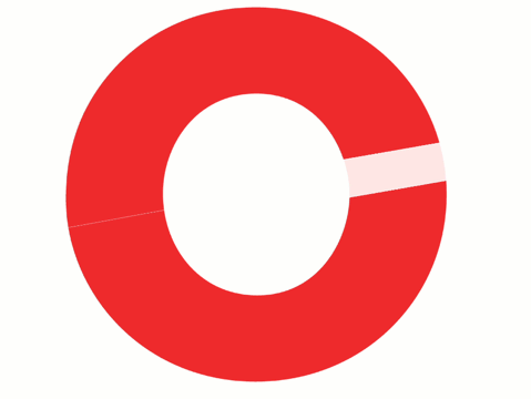
I’m not sure I understand the gauges?
The gauges show where your plan is versus the evidence-based guidelines. The green area on the gauges is the ideal target range. Orange and red are cautionary areas… performance could suffer due to over or under consumption. The red area on hydration indicates the area where hydration could cause weight gain and creates a health risk (hyponatremia); do not drink at this level!
By default, the gauges show the entire event. If you select (click on) the box below time/distance line for a particular hour, the box will highlight (grey) and the gauges will then reflect that hour’s nutrition. Selecting (clicking) the box again, will revert to full event.